
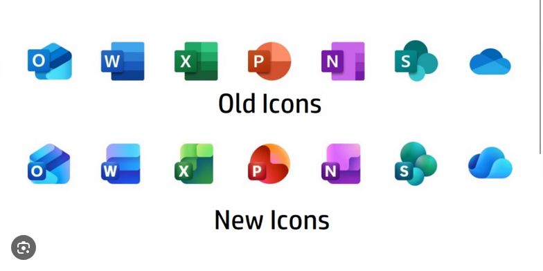
Apparently this is an unpopular opinion, but I like them.
They look like that they actually have depth rather than being flat and samey.
I always thought that people didn't like corporate logos because of their flat simplicity. I guess that was wrong.
They look like that they actually have depth rather than being flat and samey.
I always thought that people didn't like corporate logos because of their flat simplicity. I guess that was wrong.

Comments
also word and Excel are more distinct this is probably a plus for colorblind people idk